Our brand identity system is composed of 4 core elements. Logo, Color, Typography, and Composition. Reproduce those principles to increase our brand recognition across the audience journey.
The logo is our company synthesis. It brings our personality while being unique and recognizable. Combining an icon, lettering, and Rebel Pink, VTEX's logo stands out among the cold brands in the technology market.
Applications
Always prioritize the use of the logo in Rebel Pink. This is what makes our logo recognizable at first glance.
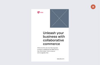
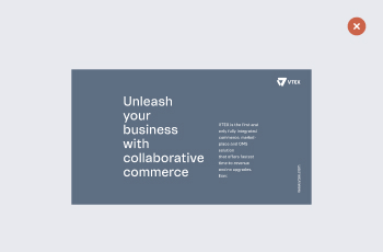
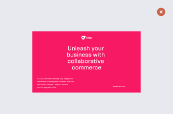
• Click on the color bullets below and see how to apply our logo to different backgrounds.
When a logo steps out into the real world, it needs space to breathe and shine to look its best. That is why we established a clearspace around it to guarantee readability.
In our case, the reference measure is the vertical axis of the word "VTEX". It's fundamental to always place other visual elements outside this blank margin in every application.
Logo crimes
Don'ts
Except for digital platform avatars, do not use icon without lettering.
Do not use the pink logo on dark backgrounds.
Do not use the logo without its clear space.
Avoid using the logo in Serious Black.
Do not apply the icon in a vertical position.
Do not use the icon as a texture.
Don’t apply it inside a geometrical form.
Never distort the logo.
Never rotate the logo.
Never use the outline logo.
Never reposition elements.
Don’t apply it with effects like shadows, glows, bevels and embosses.
Placement
Place the logo on the top or bottom left side of the composition. Only place the logo in the bottom right corner on website footers or conclusion pages. Avoid placing the logo in the top right corner.
Do
Alert
Don't
Reduction
When our logo requires a reduction in size for any kind of use, we should follow a minimum size baseline of 60px (digital), 1 cm (print) and 0.78 in (print).
Considerations
These are some good practices to maintain our brand healthy:
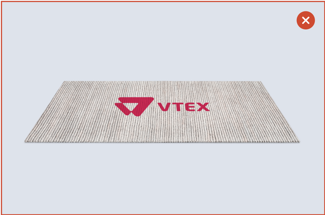
Avoid adding our logo to mats, rugs and anything that people walk on. Please protect our logo from getting dirty.
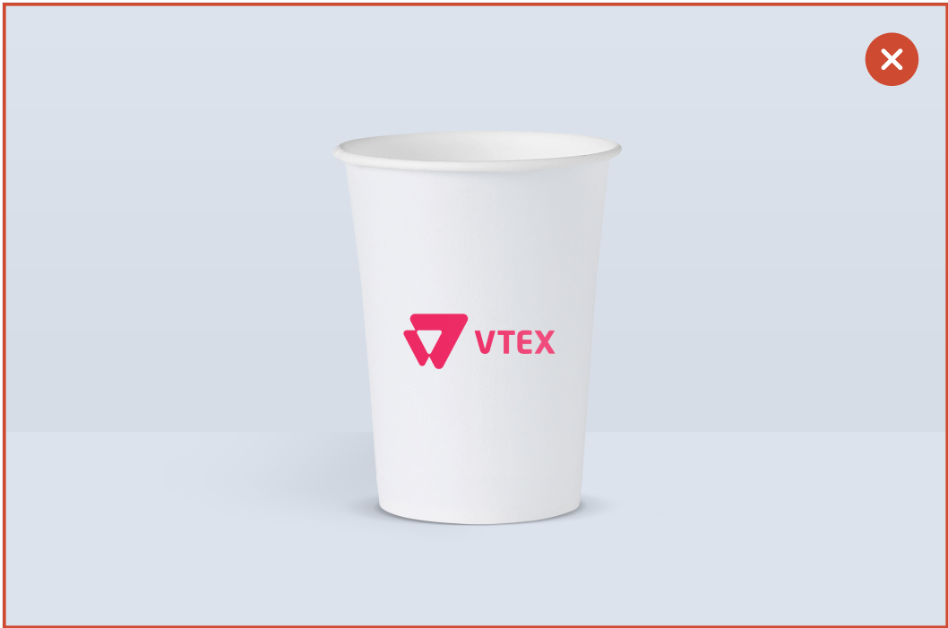
Avoid sharp objects, and disposable items such as plastic cups and paper napkins. Our logo is not designed to be crumpled, food-stained, or thrown in the trash.
Avoid using it on images that compromise the legibility of the logo.
There is no need to add the logo to internal advertisements, such as Slack channels. By removing the logo, we avoid duplication and the saturation of information.
Sticky Notes
Except in digital platforms avatars, do not use icon without the wordmark.
Prioritize the use of the logo with the Rebel Pink presence.
Colors
We are Pink
Colors are a crucial expression resource that help drive identification and set the communication mood. You'll find the main principles of our color code below.
*For printed materials, it is mandatory to use CMYK codes*
Rebel Pink is our main color. It’s one of a kind and discloses our entire personality. We use it as our primary identifier, highlighting our rebel spirit and standing out in the tech market’s blue and green ocean of colors. If you look for awareness, Rebel Pink is the best choice.
Rebel PinkPantone -
Rubine Red
#f71963
Colors derived from Rebel Pink
Derived colors are resources that compensate for the visual impact of the master color, adding flexibility and lightness to our uses.
Soft PinkPANTONE - 705 U
#fff3f6
Yogurt PinkPantone - 707 U
#ffe0ef
Bubble Gum PinkPantone - 1765 U
#ffc4dd
Secondary color - Serious Black
Serious Black transmits exclusivity and refinement, bringing graphic weight to compositions, being applied in the background in moments of content deepening or highlighting a given piece of information. Avoid using this color in a major presence.
Serious BlackPANTONE - 296 C
#142032
Colors derived from Serious Black
Derived colors are resources for compensating the main color’s visual impact, adding flexibility and lightness to our uses.
Winter GrayPantone - 5295 U
#E7E9EE
Cool GrayPantone - 7450 U
#a1a8b7
Serious GrayPantone - 534 U
#5b6e84
Balance Colors - Blue and White
The shades of blue and white are meant to balance the Pink energy. They bring the clarity and accuracy of our expert positioning.
Plain White
#ffffff
Soft Blue
#F5F9FF
Text in colors
Using a single weight for the typeface, VTEX Trust Regular, (with some exceptions to body text weights, allowing bold and italics when necessary to stress a term or phrase), our system finds harmonization in the text composition by color principles. Check the variations below:
• Click on the colors and see how the texts are applied in different backgrounds.
Color crimes
We know that using and combining colors to achieve a harmonious result can be relative. However, to ensure consistency in our visual identity, always avoid the following examples:
Avoid low contrast between background and important information.
Avoid combining Serious Black and Rebel Pink as primary colors.
Do not use colors that do not belong to our visual identity.
Avoid using similar contrasts in the composition.
Sticky Notes
If your message's purpose is to raise awareness, you should probably use Rebel Pink and its variants.
We use Rebel Pink mainly when we want to create impact covers, ads, stands.
The colors derived from Rebel Pink, Plain White and White Ice are most commonly used in pieces with more content and which require a lighter composition.
Typography
VTEX Trust, our custom typeface family, is unique and easy to use, reflecting our brand spirit, beliefs and design principles. It has been carefully designed to meet our needs as a global technology company.
We only use the Regular weight of the VTEX Trust typography. Use colors and the typographic scale to create visual hierarchy in titles, subheads, and body text. There are some exceptions to body text weights, allowing bold and italics when necessary to stress a term or phrase.
Scale
The scale creates size variations that maintain every piece with the right balance and refinement while making it easier to decide which size to use.
The system relies on the 1.5 scales (the perfect fifty) to ensure hierarchy and striking contrast between messages using only one font weight.
The space between lines follows a logic of proportion:
For headings, the space between lines must be 100% the size of the typeface. Subheads must be 120% the size of the typeface. For the body text, the space between lines must be 150% the size of the typeface.
Alignment
Whenever possible, align the text to the left. It creates a precise vertical alignment between elements, adding legibility, organization, and clarity to our composition.
Distance-based baseline
Considering a proportion of 1.5 in-text scale, different base units have been assigned according to the media viewing distance. The assignment of bases allows minimum readability regarding the various contents and the different printed media dimensions.
Text in colors
Using a single weight for the typeface, VTEX Trust Regular, (with some exceptions to body text weights, allowing bold and italics when necessary to stress a term or phrase), our system finds harmonization in the text composition by color principles. Check the variations below:
• Click on the colors and see how the texts are applied in different backgrounds.
Typography Crimes
Pay attention to contrasts when using colors.
Never use fully capitalized text.
Never change the space between letters.
Never use unofficial typefaces.
Never use words in bold for titles.
Never align the text to the right.
Sticky Notes
Only use the regular weight of the VTEX Trust typography. Exceptions to body text weights, when necessary to stress a term.
Follow the typeface color rules to harmonize the piece.
Aim for contrast across typeface hierarchies.
Composition
Typography, colors, images and textures are elements that must follow a harmonious and coherent relationship in any context. For us, communication should prioritize clean graphics, respect for blank spaces, and invest in typeface size contrast.
To support this, all pieces must have a modular grid that allows the alignment of elements and information balance.
Grid
The grid is our primary reference while assembling a piece’s composition, being the transverse and constant element whenever applying the identity.
The columns' sizes follow a symmetrical proportion between themselves. In its turn, the canvas width determines the number of columns.
After specifying the number of columns, divide the column width in four or two equal parts — Usually four, for digital media and two for print media.
Grid Construction
Step-by-step on how to build your design grid.
Set the number of columns
Using even numbers, determine how many columns best fit your composition.
Set the margins
To create the margins, divide the width into equal parts. ¼ column width = margin.
Set the gutter
After setting the margins, divide the margin width into equal parts. 1/4 margin = gutter.
Apply the gutter
When adding the gutter, redistribute the guides to keep the column spacing equal.
Equalize the margins
Apply the margin to the top, bottom, left, and right of the composition.
Composition Guidance
When assembling the composition layout, start reinforcing the content distribution on the bottom, then the top, and fill the middle.
Composition Crimes
What not to do in the guidance composition.
Always have a grid to support the content and make reading easier.
Prioritize the composition by the top and bottom of your pieces, avoiding to concentrate the distribution on the center.
Avoid aligning texts on the right; prioritizing the alignment on the left.
Besides some websites' and slideshows cases, we avoid centralizing text in other instances, prioritizing the left alignment.
Sticky Notes
Prioritize clean graphics and put blank spaces to work.
Use the type hierarchy in your favor.
When assembling the composition, reinforce the top and bottom of your layout.


